Understanding the uptake, market dynamics, and future trajectory of digital technologies across Europe’s agriculture and forestry sectors requires both field-level empirical ground truth and forward-looking market intelligence. The 4Growth Visualisation Platform serves as the central open-access hub designed to transform these complex data streams into intuitive, actionable insights for policy-makers, technology providers, farmers, and researchers.
We are excited to announce the official launch of the fully updated public platform. Building on initial testing and early foresight integration, this release delivers a fully harmonised, multi-source analytical experience accessible at visualisation.4growth-project.eu.
Here is a breakdown of everything new on the platform.
The cornerstone of this final release is the complete consolidation of the primary survey dataset. Rather than presenting phase-specific views, the platform’s Survey Analysis dashboard now ingests all primary survey data collected across European observatories. This represents a total of 1,723 survey responses.
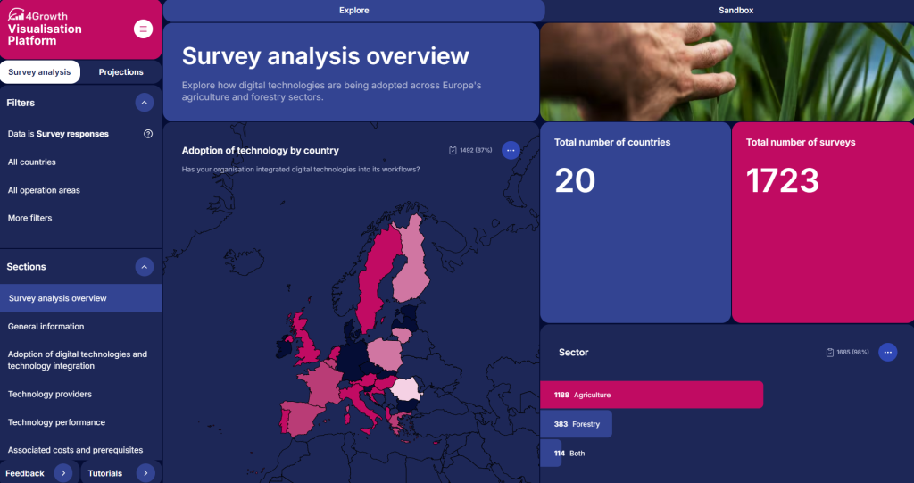
To ensure these distinct collection phases function as a cohesive whole, an extensive data cleaning and harmonisation pipeline was executed to resolve differences in survey question phrasing, normalise scale answer formats and unify category labels and response choices.
Our field outreach yielded a final sample of 1,723 responses. To complement field data, boost sample density, and address regional gaps, the team strategically integrated automated web-scraped data.
This automated dataset uses AI-based information extraction to capture digital technology uptake directly from company websites and online footprints across 2,438 forestry organisations in 24 European countries.
To support this dual-source structure, the platform introduces a dedicated Data Source Filter. Users can seamlessly switch between:
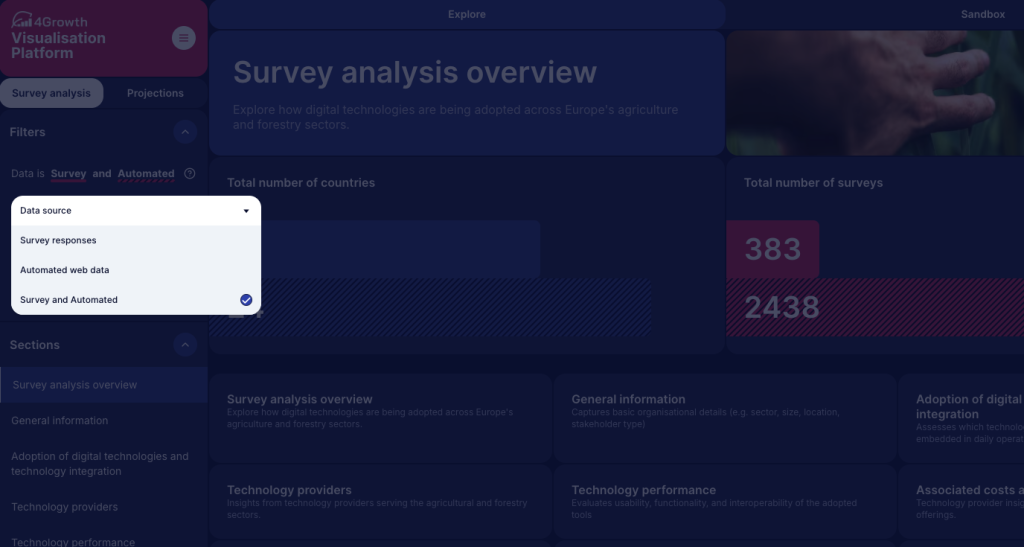
When the comparison mode is active, dashboard widgets automatically adapt: primary survey results are displayed using solid color fills, while automated web-scraped data is rendered with a distinct diagonal hatching pattern. This visual contrast allows decision-makers to directly benchmark self-reported stakeholder feedback against web-harvested market presence. An inline information icon (?) opens a Data Sources Modal explaining the collection parameters and methodology for both streams.
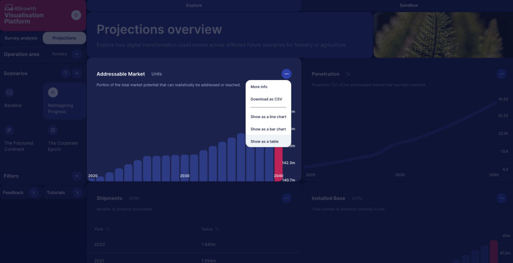
Beyond historical survey data, the Projections tab equips users with forward-looking market intelligence powered by the Model-Based Multi-Factor Tool (MMFT). The platform integrates the completed, updated MMFT dataset, providing refreshed market trend forecasts through 2040 for both agriculture and forestry.
The multi-variable Sandbox tab has been tidied rather than rebuilt. Filter lists for Sector, Operation area and Stakeholder type no longer carry duplicate entries or N/A options. Pie charts now switch off automatically once you add a second breakdown variable, as this option cannot carry two variables at once. When a filter combination returns no matching responses, the platform displays a clear, standardised fallback state (‘’No data available for this item’’).
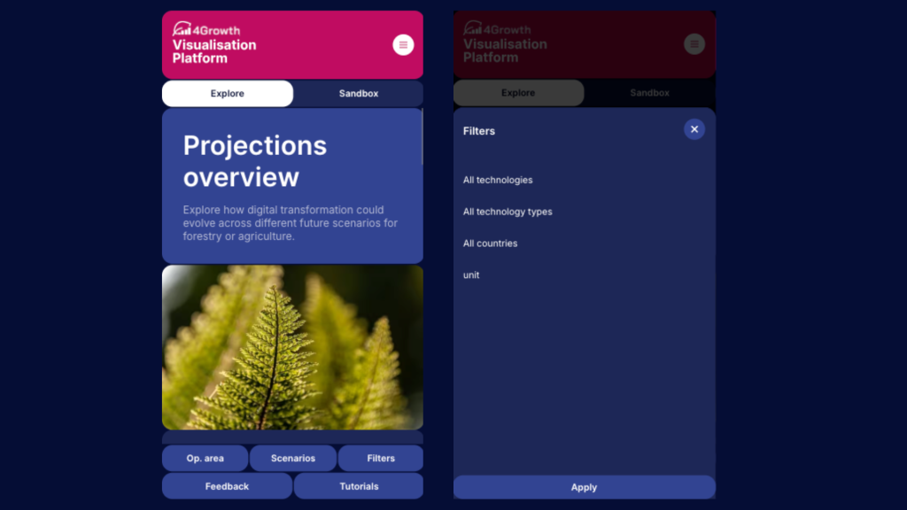
Dashboards now reflow into a single column on smaller screens (smartphones, tablets). Maps, bar charts and time-series graphs respond to touch. Filter menus collapse into a drawer reached from a fixed bottom bar, which carries shortcuts to Operation area, Scenarios, Filters, Feedback and Tutorials. The practical effect is that an adviser can pull up national adoption figures during a farm visit rather than after it.
To support platform adoption, direct navigation shortcuts are now located at the bottom of the primary sidebar:
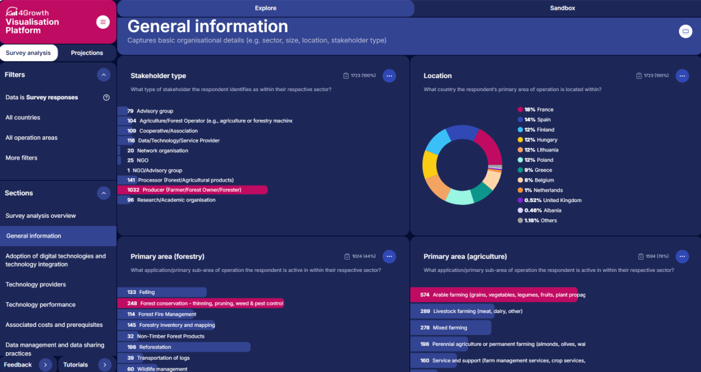
The updated 4Growth Visualisation Platform brings three kinds of evidence into one place. Survey responses show what organisations report doing. Automated web data shows what they present to the market. Econometric projection shows where both may be heading. No single source answers the question alone. Read together, they lower the risk in investment and policy decisions across European agriculture and forestry.
Access the live platform: https://visualisation.4growth-project.eu/
Explore the open-source code: https://github.com/Vizzuality/4-growth
Sign up to stay informed of news, key outputs and upcoming events!